ShadowPOS offers an intuitive website editor to build a fully fledged ecommerce store from, accessible conveniently within HQ itself. Link collections directly to browsable web pages; display a full month's calendar of color coded events; display store blogs, videos, and more. Advanced users can also utilize custom HTML for unique homepage blocks, or even custom CSS and JS to really propel your site into a league of its own.
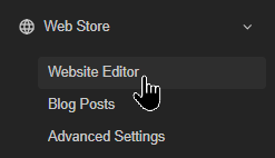
Visit Web Store > Website Editor
First look: Category Editor and Preview group (top)

There are two distinct toggle groups at the top of the Website Editor:
- Category Editor group: Switches between four different tabs to edit various aspects of your site:
Pages
Navigation
Theme
Settings - Preview group: Switches between three standard preview modes to simulate typical viewer experiences:
Desktop
Tablet
Mobile
Category group: Pages
This is mostly your homepage's design (store banner, content blocks, event calendar, etc.). Create custom pages here, too. Each element of your homepage is built from Blocks. Choose one to configure and add to your homepage.
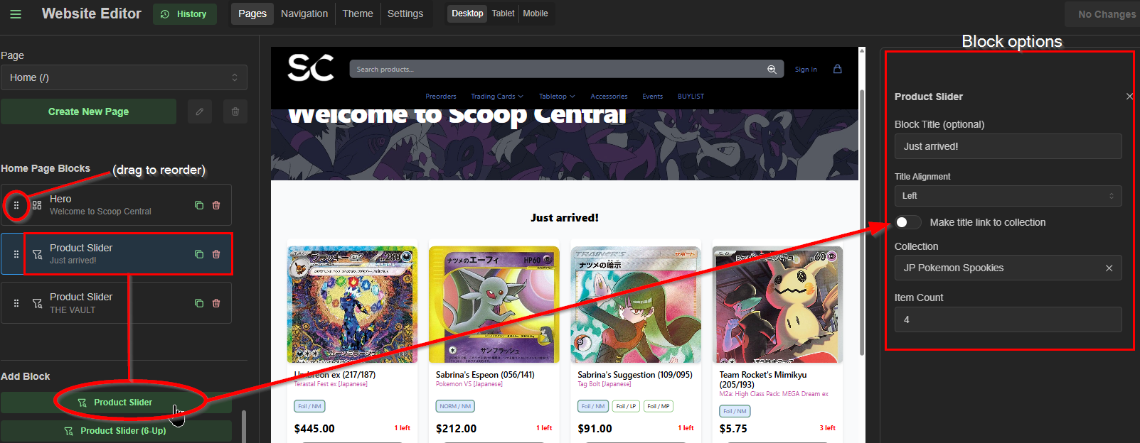
at a glance: Block options
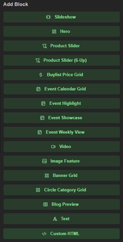
Each block consists of its own unique parameters; click one to configure, then save to preview!
Hint:
Oops! Need to reverse a few changes made recently? Click the History button and choose a time/savestate to revert back to a previous iteration of your webstore.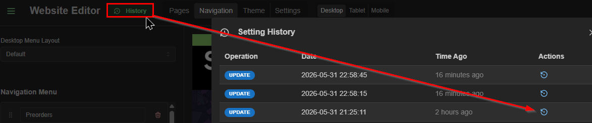
Category group: Navigation
This is how you'll link everything in your main menu to their respective collections, custom pages, or external links.
Choose '+Add menu item' to begin linking right away.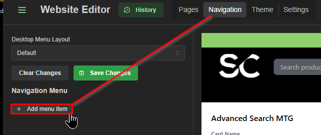
Name the menu item, and click in the URL box to auto-populate choices you already have access to, such as previously made pages, collections, or special advanced searches for some singles catalogs.
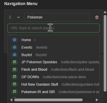
Choose one, or provide any valid web address and you're ready to go as soon as you save changes.
example: Desktop Menu Layout - Default + simple link
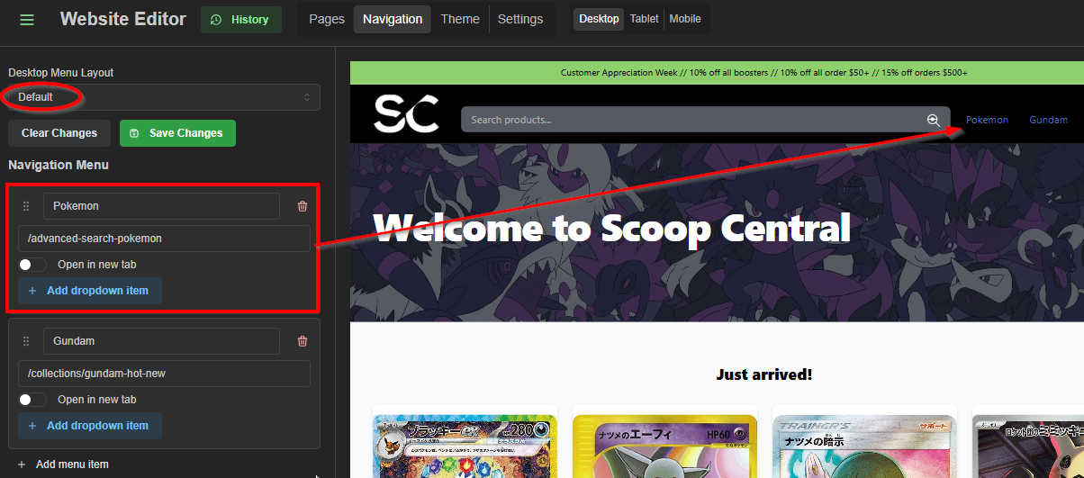
Here we've set the URL to the special Pokemon advanced search.
example: Desktop Menu Layout - Default + additional routes and linking
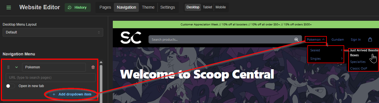
More complex menus are possible by simply adding additional routes/links to your original navigation button, but it may be cleaner to take advantage of the 'Mega Menu' layout if you have more than a few navigation buttons like this.
example: Desktop Menu Layout: Mega Menu
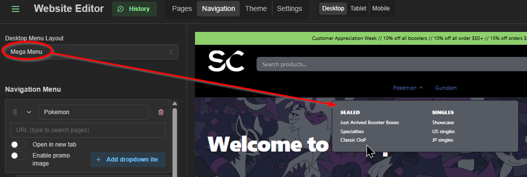
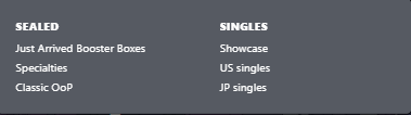
The Mega Menu provides a cleaner look when you have multiple dropdown menus for a single button. Here we've gathered the same Pokemon navigations into one navigation button, but a bit cleaner than using the Default menu layout. Just something to keep in mind.
Tip: Use these URLS instead of basic catalog collections for special 'Advanced Search' features (collection-agnostic)
- /advanced-search-mtg
(Magic: the Gathering ) - /advanced-search-pokemon
(Pokemon) - /advanced-search-onepiece
(One Piece) - /advanced-search-lorcana
(Lorcana) - /advanced-search-riftbound
(Riftbound) - /advanced-search-yugioh
(Yu-Gi-Oh!) - /advanced-search-fab
(Flesh and Blood) - /advanced-search-gundam
Gundam - /advanced-search-swu
(Star Wars: Unlimited) - /advanced-search-hololive
(Hololive) - /advanced-search-shadowverse-evolve
(Shadowverse Evolve)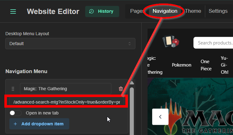 Tip:
Tip:
Append one of the suffixes below to the end of an advanced search route to preload a default search option: - ?inStockOnly=true&orderBy=price-desc
(In-stock only sorted highest price first) - ?inStock=true&orderBy=last_stocked&order=desc
(In-stock only sorted newest arrivals first) - ?inStock=true&orderBy=price&order=asc
(In-stock only sorted cheapest first) - ?inStock=true&orderBy=last_sold&order=desc
(In-stock only sorted most recently moved first)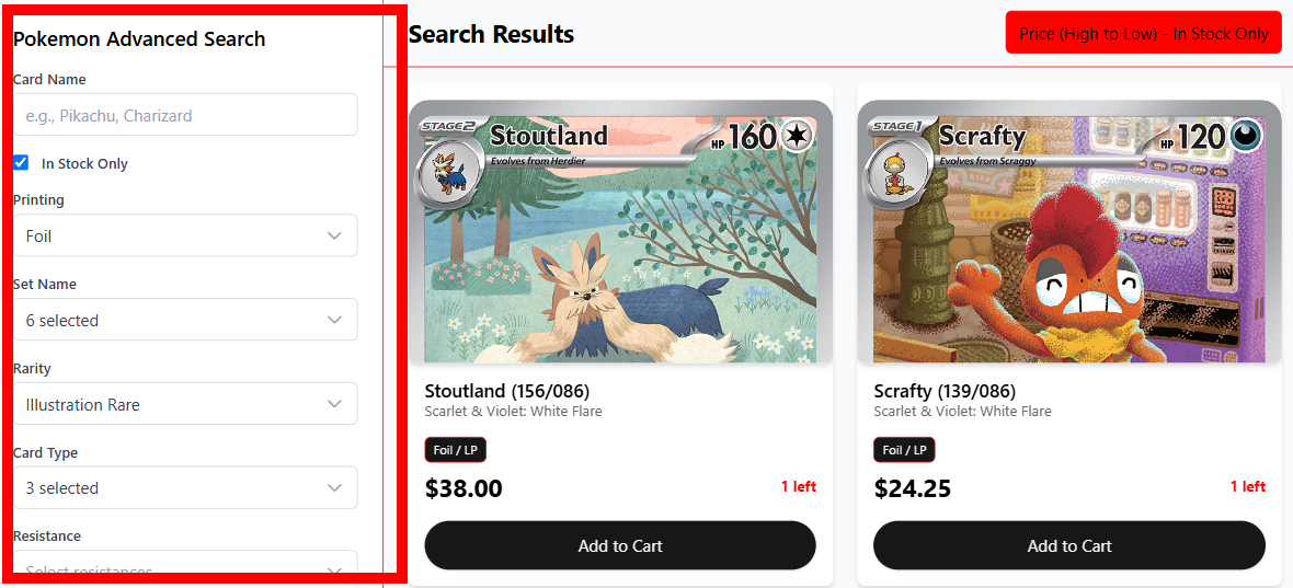 example: /advanced-search-pokemon?inStockOnly=true&orderBy=price-desc
(Pokemon in-stock only, sorted highest price first)
Note: Some advanced searches will provide additional options if available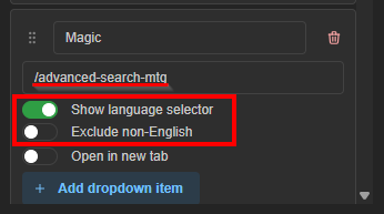
Category group: Theme
Here's where you'll choose the color scheme that best suits your store's identity. This section will cover which options set the color of specific elements in your webstore.
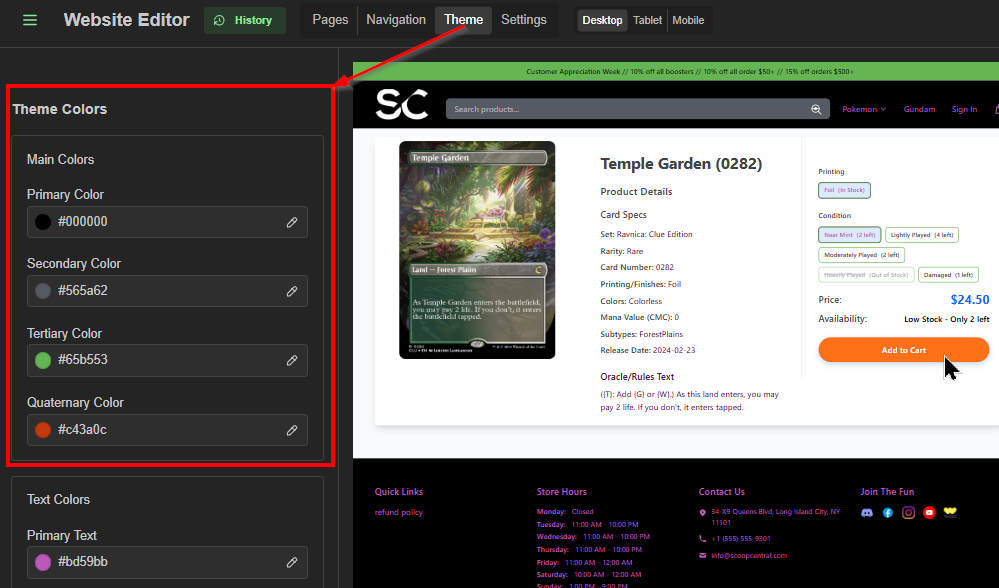
There are 18 customizable theme colors
Here's a brief rundown of what aspect of your webstore each affects:
Main Colors
- Primary
navbar background, dropdown menus, mobile menu, calendar header, active filter buttons. Your main brand color., - Secondary
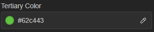
secondary UI elements, mega menu promo buttons, user avatar badges., - Tertiary
announcement banner background, popular search suggestion pills, event card gradients., - Quaternary
borders, dividers, inactive filter button borders.,
Text Colors
- Primary Text
nav links and menu items (text on primary-colored backgrounds)., - Secondary Text
text on secondary-colored elements (e.g. mega menu promo button)., - Tertiary Text
text on tertiary-colored elements (e.g. announcement banner text)., - Background Text
general body text, headings, product detail text on white/light backgrounds., - Background Secondary Text
subtitles and secondary body copy on white/light backgrounds.,
Hover States
- Primary Hover
what primary-colored backgrounds shift to on hover (nav icon hover, button hover)., - Secondary Hover
hover state for secondary-colored elements., - Tertiary Hover
hover state for tertiary elements (e.g. popular search pill hover)., - Primary Text Hover
nav link text color on hover., - Background Text Hover:
body-area link text color on hover.,
Special Colors
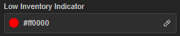
- Low Inventory Indicator
the "X left" warning text on product cards and the product page when stock is low., - Add to Cart Button
the Add to Cart / Buy Now button., - Product Selector
the selected/active variant option button (e.g. the highlighted condition or printing pill on a product page)., - Variant Price
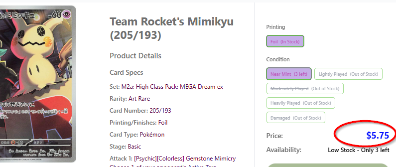
the large price display on product detail pages.
Some prominent visual examples:
Main Colors section
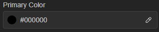
Site header, default menus Site info (bottom)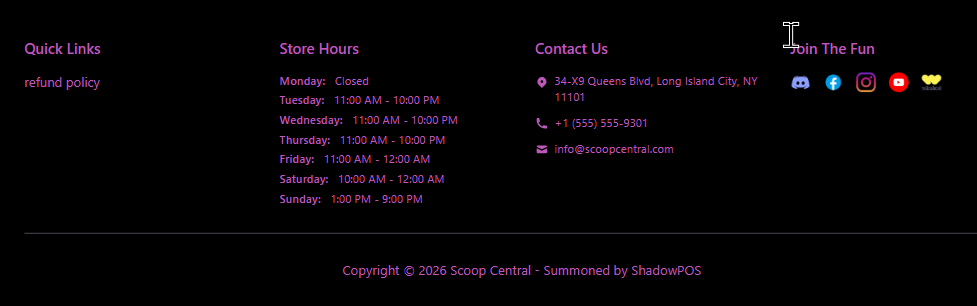
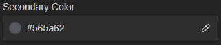
Searchbar, and other entry fields
 Mega menu
 Event time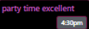
Top banner [default]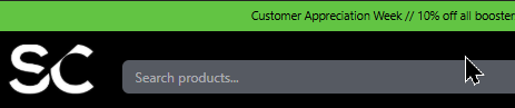
Button outlines

Weekly Events block headers

Sort method dropdown
Text Colors section:

Navigation

Variant selection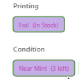 Buttons
 Home page info (bottom)


Searchbar

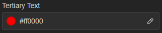
Weekly Events block

 Titles, reminder info, price, in-stock indication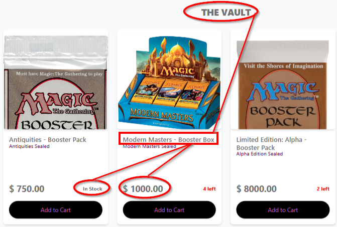

Description details
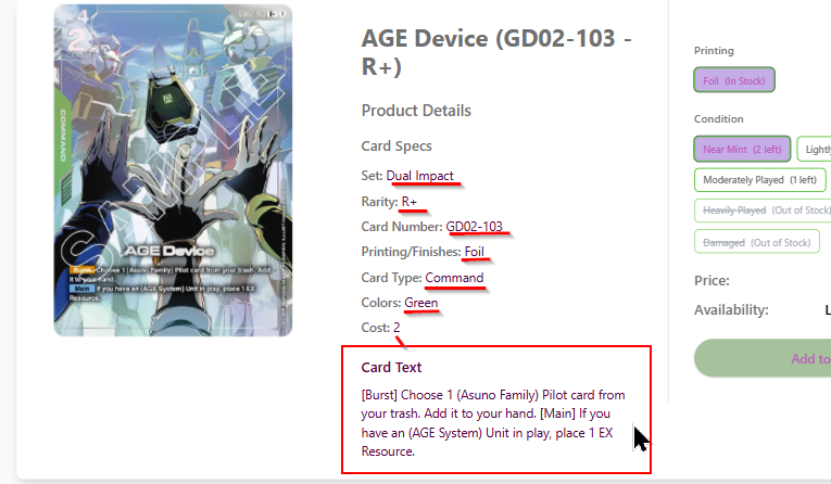
Set names / subtitles
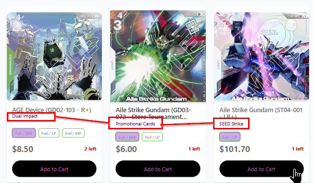
Supplemental info
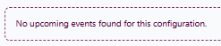
Hover States section: 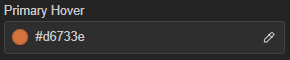
Add to Cart button

Special Colors section:
Individual product
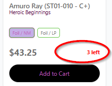
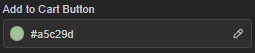
Cart Button specific to product's page
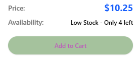
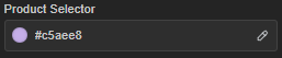
In-stock variants only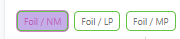

Price specific to a product's page
Category group: Settings
Configure all your webstore's information from store hours to social links, or from Google analytics to custom code. Activate a kiosk, enable shipping, add some extra checkout options, or just set your store to 'under construction' while you spruce things up. Everything else you need can be found here.
Options available:
Basic Information
- Your site name/description; SEO keywords
Contact Information
- Displayed in site footer; includes store email, phone, address, map links
Custom CSS
- Allows you to change the visual design (colors, fonts, button styles, etc) and layout beyond the standard themes of the editor
Custom JS
- Allows you to extend functionality by modifying the storefront behavior, appearance, etc.
E-commerce Settings
- Enable/disable shipping ; configure default delivery method; add/remove checkout pickup options
Floating Image
- Floating configurable image with/without link, that persists between pages
Google Analytics
- uses a Google Tag to measure your webstore's traffic, user behavior, and marketing performance
Kiosk Settings
- Enables kiosk mode on a kiosk browser that enables customers to send orders to the register
Logo & Branding
- Link or upload your store's logo (appears on the homepage), favicon (to help with store identification in web search / browser tabs / home screen shortcuts), and social share preview image (appears when links are pasted to social media platforms / messaging apps / emails)
Meta Pixel
- uses a Pixel ID to track visitor actions (page views, cart additions, purchases, etc)
Popular Searches
- Add various keywords that will appear as search suggestions on your webstore
Privacy & Cookie Consent
- Enable/disable a consent banner plus script gating with configurable 'accept' and 'deny' buttons
Social Links
- Link your business's various social accounts here. They appear as icons in your webstore's footer section
Store Hours
- Set your store's weekly operating hours with fully adjustable text fields
Top Banner
- Fully adjustable announcement banner located above the header of each webstore page
Under Construction
- Replaces storefront with a landing page prohibiting customer-side exploration. Offers custom headline and message field.
Enabling kiosk mode
Kiosk mode transforms configured devices into customer-friendly order submission terminals. It can enhance the customer experience by empowering shoppers to browse inventory, check prices, and submit orders on their own. ShadowPOS offers the ability to activate kiosk mode on one or multiple devices by using special keys to alter the webstore checkout process for specified machines.
Visit Web Store > Website Editor > Settings > Kiosk Settings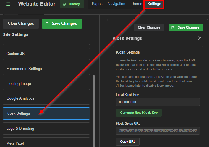
Kiosk options:
- Disable tenders (toggle) - When enabled, the payment section will be hidden on the checkout page for kiosk users
- Require name at checkout (toggle) - When enabled, customers must enter their name before submitting a kiosk order
- Confirmation Redirect - After a kiosk pickup order is submitted, redirect the confirmation page to a specific URL
- Confirmation Message - Customizable info or instructions shown in the 'Submit for pickup' modal during checkout
Two methods of activating a kiosk:
A) Kiosk key (manual)
B) URL (auto-set)
A) Setting up manually via kiosk key:
1) Enter a unique string of characters into the Local Kiosk Key field, or click 'Generate New Kiosk Key'
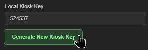
2) Visit yourwebstore.address/kiosk on the designated kiosk device(s) 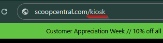 3) Enter the kiosk key, and click 'Enable Kiosk Mode'.
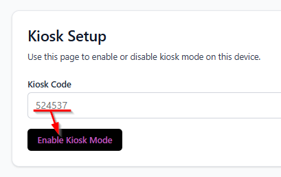 4) Return to your webstore; kiosk mode is active
5) Visit the */kiosk page anytime to confirm kiosk status or deactivate kiosk mode
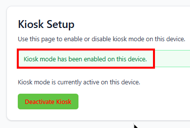
Attention: If you generate a new kiosk key, you'll need to reset any active kiosks
B) Setting up automatically via URL:
1) Copy the provided Kiosk Setup URL
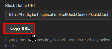 2) Paste (Ctrl+v or Cmd+v) the copied address into the address bar on the desired system's web browser)
 3) Return to your webstore; kiosk mode is active
4) Visit the */kiosk page anytime to confirm kiosk status or deactivate kiosk mode
Was this article helpful?
That’s Great!
Thank you for your feedback
Sorry! We couldn't be helpful
Thank you for your feedback
Feedback sent
We appreciate your effort and will try to fix the article